The time confusion created in this film's editing is pretty interesting in that it's subtle yet the technique it uses (jump-cutting?) is pretty jarring (which adds to the effectiveness). It took me a while to understand what is going on.
In this sequence, we are given two constants: The cop character walking up to the counter to order takeout for his girlfriend and Faye's repetitive cleaning motions.
Time is condensed into an extreme. There is nothing to suggest a change from one day to the next other than the dialogue and Faye's costume changes. The cutting to mark the next day are bridge by Faye's cleaning and it is here we are almost induced into a feeling of deja vu as the cop (in the same uniform he wears everyday) places his order. It the continuity feels seamless yet it isn't quite.
I've seen this sort of technique before but it always involved someone motionless as the background elements is sped up. In Chungking Express, I feel like this was done in an ingenious way. Having the character move in slow motion against the sped up back drop heighten his disconnect with reality, despite his evident steadiness. Another contradiction.
Godard's films have been been one of the major influences of my own work for a long time. Not so much in content but more in technique and style (though not as much now). I'm not sure the proper film language to describe it (its not montage), but there is definitely a collage like way he puts together his films. Text, images, and sounds intercut into the dietetic world of the film and yet it all works together. The title sequences and trailers are basically condensed versions of the films, accurately reflect the crazy energy, flow, and rhythm of the narrative.
In terms of editing and sound, Peter Watkins' film is an incredibly poetic and lyrical take in the life of Edvard Munch. The past, present, and future blend together in the narrative, sounds carry from time to another. In the example above, a group of artists have a discussion about Munch and laugh about his Puritan up bringing. Then it cuts to a shot of Munch in his room crying. Interwoven in the the sequence is also of scenes of Munch's mother's death, with the sounds of Munch's sobs and the laughter of the artists carried through out. Even though these events are totally unrelated in a linear understanding of time (the first is from the present, the second we later learn is from the future, and the third is of the past) the decision to edit this way adds another layer of meaning to the moment at hand, of endless torment and sorrow.
I'm struggling a bit in making a piece for our coming show. My first instinct was to do a video projection or some sort of work with monitors. However, the installation space is a public area where security would be an issue. Not that it should deter me, but feel that even with a video, it seems like it would get lost in the space somehow. So I see as an opportunity to do some print based work, but still conveying a passing of time or a potential to shift perspective.
The above are sketches made using found images from an old home movie and crayon. The act of mark-making cover details but also seem to make the images more alive, as if to activate a memory. Through activation, memory is animated but not accurate.
Since these are stills from a film found on an online archive, I feel like there might be conceptual issues surrounding the use of media. The footage has gone through stages of mediation will continue to do so if I choose to go forth with this project. Existing as an actual film, it has been digitized (with the level of quality reduced), then will be printed, and marked. The question I pose is this: Is there a difference in the project if I marked the actual film vs. marking the mediated image? How is it different from marking a photograph? Somehow I feel that trying to "animate" a film after printing it as stills is a little redundant. Perhaps it's an attempt to give it new life (abeit a false one)? Is it just an illustration of movement? I don't know yet.
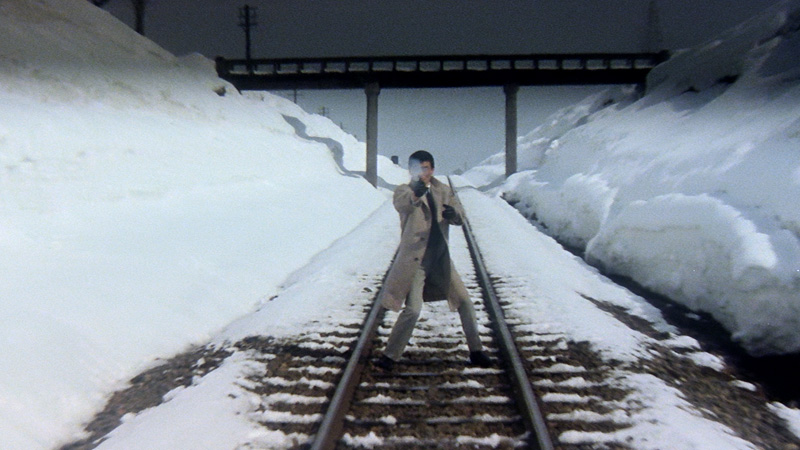
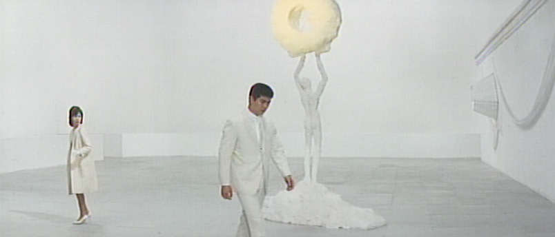
As visually chaotic as Tokyo Drifter appears to be, on a purely abstract level, the color design in this film can operate entirely as its own (separate from the scripted narrative)
and tell the same story without effort. What is unsaid or uncertain by
scripted means is made clear and reinforced through the use of
color.
I'm quite partial to jarring cuts in between sequences of film
(regardless of how obsessive they seem or how much they challenge
continuity) because they are bizarrely contradictory: the successions of
cuts are quick and yet they seem to slow down the moments they
interrupt as if the brain is taking extra time to sort out the
condensely packed images (I suppose this is actually the case).
Here are some examples of interesting "quick cuts" I've come across recently.
Mean Streets (1973)
The entire title sequence is incredible---from the cut to a projector that comes out of nowhere, to the home movie, to the music---but the cutting that takes place in between the shots of Charlie's head hitting the pillow is what I want to talk about. As the character falls back in slow-motion, the camera cuts closer and closer to his face. Yes, the editing matches the beat of the music, but abrupt cutting of a single action paired with the slow-motion is fascinating. It is at once both jarring and dream-like, informing us that we are about the enter Charlie's psyche, one of heavy conflict, contradictions, and sensual rawness.
Stolen Kisses (1968)
(Note: Obviously, we'd get a better sense of the rhythm editing with a video, but I couldn't find a clip of this scene anywhere.)
Working as a detective, Antoine Doinel loses sight of the magician he's suppose to be tailing when he decides make a phone call to his girlfriend. Realizing this, he exits the phone booth in a hurry. In what could have been filmed within one shot, what we get instead is an odd series of shots from two different perspectives of him leaving: One from an interior shot in the booth and one exterior. The sort of "rack" cutting of between the two shots happen rapidly, lasting less than a second. It's almost like a subliminal message or even a glitch, as if someone accidentally included a couple frames from the next shot when cutting the scene together. This disruption in the follow of Antoine's exit heightens the anxiety of the situation (though rather quickly) with the flash of the interior shot attempting the keep Antoine within the booth when he clearly needs to leave.
Let me stress the fact that the cuts are telling us this information, not necessarily what is happening within the shot.
The Color Wheel (2011)
This example is a little different of the first two. It's more about condensing time and space than adding extra information to the scene.
At first glance, the cutting of this transition moment between locations seems somewhat strange. As the brother and sister duo, Colin and JR, make their way from a motel to the diner, we first see a shot of a car driving on the road, then a cut to the car pulling up to the diner, and a final cut of the car already parked with Colin and JR walking into the restaurant. We have witnessed a jump-cut people! What make this interesting is that the attempt to condense time is somewhat negated by the car moving in the first two shots and then is stationary in the last one.
I was listening to Filmspotting the other day---its a great movie podcast by the way---and I happened to catch a tidbit about this strange connection between a scene from David Lynch's Mulholland Dr. (2001) and the ending of Singin' in the Rain (1952):
Watching these two clips back to back, there a feeling of this hidden narrative that haunts both films (Perhaps more for Singin' in the Rain than for Mulholland Dr.) It is our human nature to find a connections to and make sense of what we are seeing. When viewing them in this order, I don't attribute Lina Lamont's expression of anxiety to the curtain being lifted from the stage and being exposed, but to what happened to the singer in Mulholland Dr. Whether or not it was Lynch's intention to directly reference Singin' in the Rain (does anyone know?), this comparison definitely speaks to the power of the film archive as a ever changing meta-narrative.
The view of the set is made visible. We are watching a movie.
Have a gander everybody:
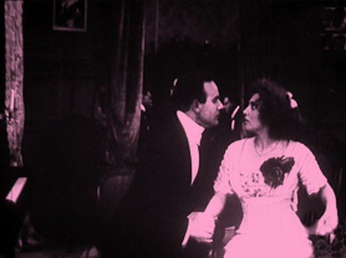
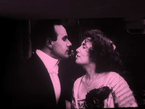
Here, Aitor Gametxo reorganizes the film "The Sunbeam" from 1912 by D. W. Griffith into the prefect six-rectangle grid “doll-house” where the movements of the characters are perfectly choreographed to interact with the hidden structure.
In this Rear Window timelapse, Jeff Desom dissects the scenes from Hitchcock's film and---since everything was filmed from pretty much the same angle---he was able to match them into a single panoramic view of the entire backyard with the order of events staying true to the movie's plot.
Especialy in early cinema, the camera rarely moves from the position of 180 degrees from the subject and is typically inter-cut with the occasional medium shots and closeups. Because of editing, the spatial structure of a film is often not noticeable when it constantly cuts back and forth between shots. These are fascinating examples that breakdown and reveal the surprisingly simple way of how well known filmmakers compose various shots to explore location within the narrative.
There are only so many ways you can answer a telephone.
The appropriation of Cinema in art has been around for a while, but it never seems to go out of style. Using cinema (or television) as an archive of human history gives us an idealized and somewhat condense view of society. Even basic human activities (waking up, getting out of bed, eating, etc.) are captured and preserved on film and we tend to see similarities in the presentation of those activities across many different films. It creates its own dialogue out side of narrative, one that considers the whole scope of film history parallel to human history.